Emily Ley Simplified Planner for At-A-Glance and The Foundation Planner Planner Review
This post may contain affiliate links which means I make a commission if you shop through my links.
Disclosure Policy
Disclosure: Product for this post was provided by At-A-Glance. All opinions are my own.
You all know that I am a huge planner fanatic. A good planner can help you to improve your productivity, stay organized, and also provide an outlet for your creativity.
But to make a planner work, you need to find the right one for you. With so many great options out there, it is hard to choose the one that meshes with the way you think.
So, my goal, here, is to showcase a variety of planners to help you make your decision.
Today, I will show you three planners from At-A-Glance. You may already be familiar with their planners as they have been around for a long time. In fact, I think my very first planner was an At-A-Glance planner.
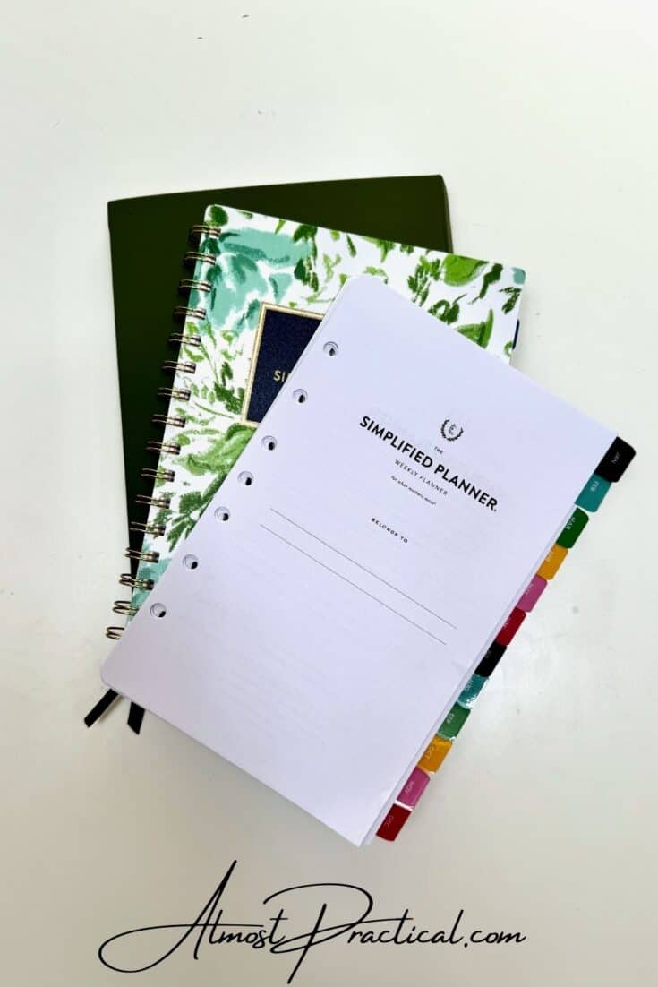
Over the years, their line of planners has evolved and expanded so I encourage you to check out everything they have to offer here – as what I am showing you is only the tip of the iceberg.
However, I am super excited about the three planners I chose and I think you will really like them too!
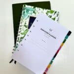
If any of you are fans of Emily Ley, a version of her Simplified Planner is now available from At-A-Glance. I will be reviewing her coiled book as well as the inserts for the ring agenda.
And if you are looking for something specifically to help you achieve your goals, then the At-A-Glance Foundation Planner is just the thing for you.
Let’s dive in!
Watch The Review Here or Read The Post Below
The Simplified Planner by Emily Ley from At-A-Glance
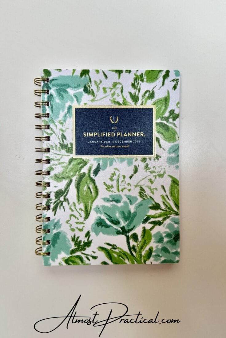
Over the years I have heard so much about The Simplified Planner by Emily Ley and have always been curious, but never got around to giving it a try.
So when At-A-Glance reached out to me to review some planners from their collection, I was really excited to see The Simplified Planner on their site.
While I need my planner to be functional, I also really like it to be pretty. Somehow, I am more motivated to use a pretty planner than I am to use a plain one.
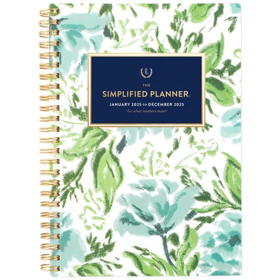
There were so many gorgeous patterns to choose from but ultimately I went with this Greenbriar Floral design.
The Cover, Size, and Binding
This particular planner is approximately an A5 size, measuring in at 8.5 inches by 5.5 inches, although the cover and coil add a bit more to the footprint.
The cover is made from a sturdy plastic and the font design has attractive metallic gold accents. The coil is also gold in color.
I don’t know what I was expecting, but I was a little surprised at first that the cover was made of plastic. However, I really do like it because it serves to protect the book.
Because I use my planner all the time, it often gets tossed around in my bags or left on a sticky kitchen counter. I love that I can just wipe down the cover don’t have to worry about the corners getting all dog-eared.
The Inside Layout
The Simplified Planner by Emily Ley for At-A-Glance is a two page per week planner and is set up as follows.
The first page is a set of functional stickers that you can use to help you with your planning.
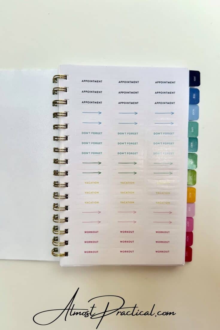
Then you have your title page and few explanatory pages on how to use the planner for maximum productivity.
You then have a page that lists the holidays for the year followed by a checklist page for your Bucket List. This is a great page to have smack dab in the front of your planner so you can be reminded of all the things that you really want to do this year.
After this, you move right into your monthly and weekly spreads.
Each month starts with a 2 page per month spread and is tabbed in a beautiful color. The days of the week are highlighted in the same colorful palette. There is also a column on the left where you can make your To Do list for the month.
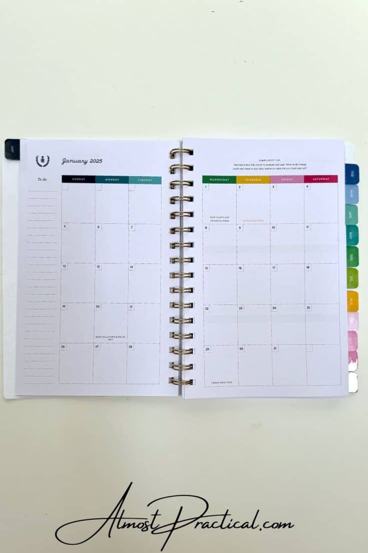
Following your monthly spread are the 2 page per week spreads for each week in the month.
You have sections for Monday, Tuesday, and Wednesday on the left hand page and sections for Thursday, Friday, with Saturday and Sunday sharing a section on the right hand page.
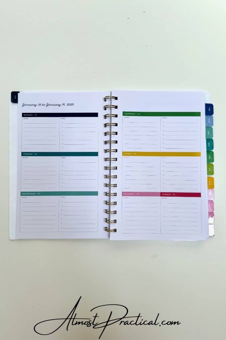
Each weekday section is divided into two halves with one side being a blank lined section and the other side being a checklist style section.
You can use these any way you want but typically you would outline your day on the lined side and create your daily to do’s using the checklist.
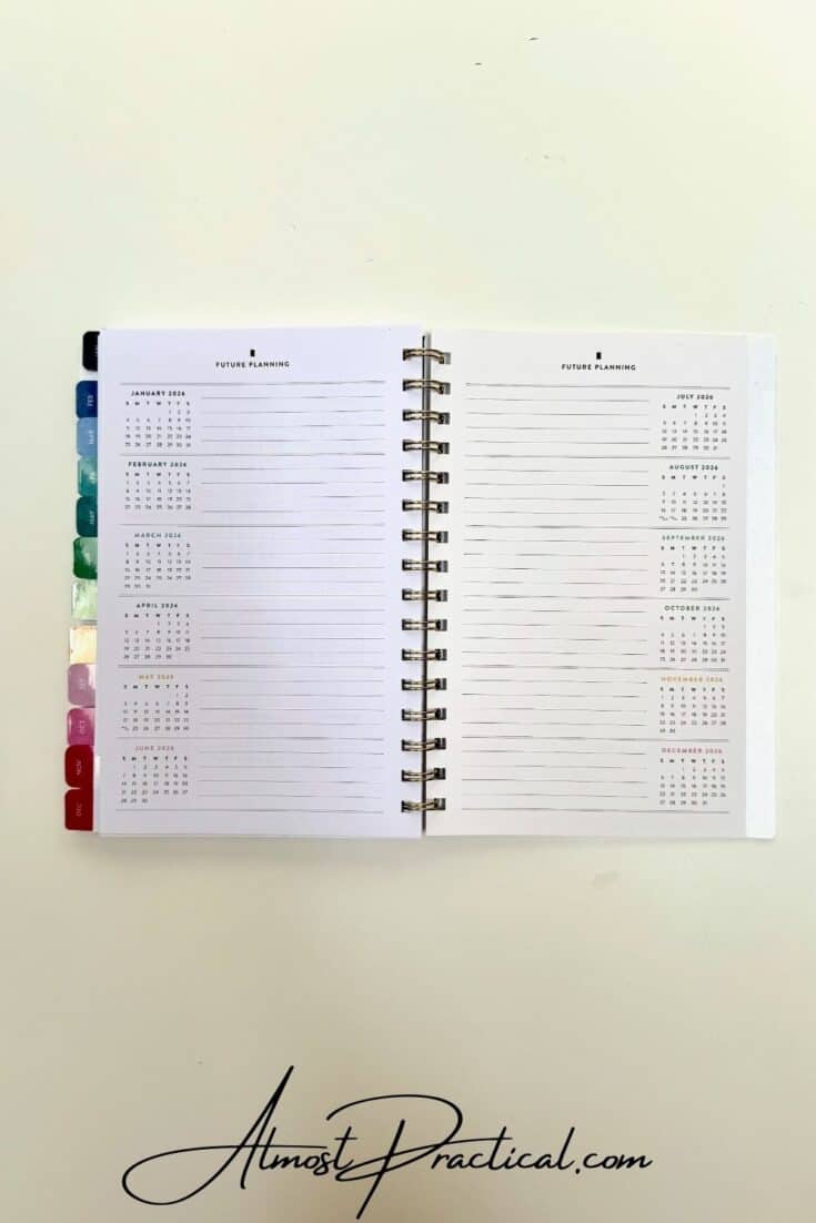
At the end of the planner you have pages with mini months for the year and the year ahead as well as a two page spread for future planning.
Pros and Cons of the At-A-Glance Simplified Planner by Emily Ley
Overall, I do like At-A-Glance version of The Simplified Planner by Emily Ley – and I love the cover design of the Greenbriar Floral pattern that I ordered.
The planner is pretty, accented with happy colors, and the layout is both flexible and useful.
It is a great way to get into The Simplified Planner especially if you are on a budget.
However, I did find the paper that the planner is printed on to be a bit thin and would have liked to see a heftier page.
Also, on the weekly layout, I felt that the wide header wastes a lot of space that could have been incorporated into making the daily sections a bit bigger. On the flip side, you can use this blank space at the top of each page to make notes for the week or decorate your planning with some planner stickers or washii tape.
At-A-Glance Simplified Planner Ring Agenda Weekly Refill
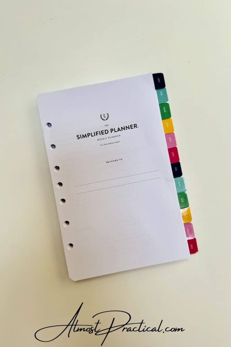
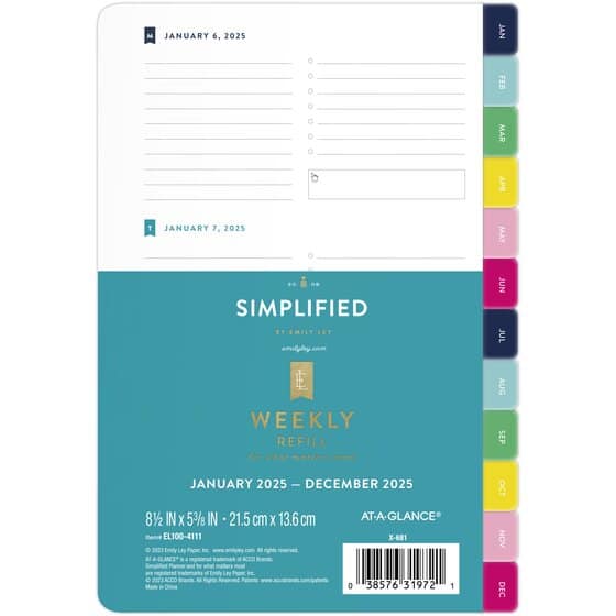
The next item that At-A-Glance sent to me was The Simplified Planner ring agenda weekly refill.
This refill is also approximately an A5 size and is designed to fit into a coordinating cover that is sold separately. Alternatively, you have this option to buy both the cover and the weekly refill as a set.
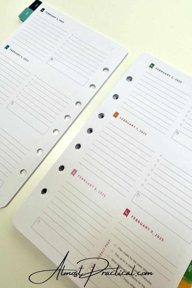
Note that the pages of the refill are punched with 7 holes set up in a unique pattern so they may not fit into all brands of binder covers.
The weekly refill layout is very similar to the coiled Simplified Planner outlined above with a few differences.
As with the coiled Simplified Planner, the refill begins with the introductory pages and the Bucket List page.
Then you move into your Monthly and Weekly spreads which is then followed by a blank lined Notes page (this is different from the coiled version) and then your two page per week spreads.
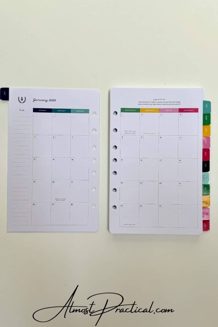
The monthly spread does include the column on the left hand side for your monthly To Do list.
The weekly layouts are sectioned similarly to the coiled version but you do not have a large space for the header at the top and the incorporation of color is more in the text than in actual headers.
Each day has a little box at the end with a little simmering pot icon, presumably for you to outline your meal planning.
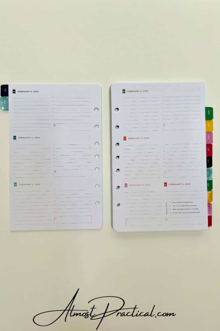
And the Sunday layout adds in a guided checklist to help you plan out your week ahead. However, this checklist takes up most of the space for your Sunday so you are left with only 3 blank lines for planning your day. If your Sundays are lazy and unstructured, then this will work out just fine.
The end of the refill is slightly different as well, in that you have a few pages to add some contacts and you also have a few extra blank lined pages for notes.
Pros and Cons of the Weekly Refill
The ring agenda planner format has a few plusses and minuses. First, the format is very flexible because you can add blank pages and items. However, the At-A-Glance 7 hole format is a bit unusual and it may be difficult to find the correct hole punch.
Another thing to consider is that when open, a ring agenda binder will take up more space on your desk than a coiled planner.
As far as the Emily Ley Simplified Planner refills go, I really do like the layout and also the guided planning on Sundays. I often need that little reminder to get organized for the week ahead.
One thing that I think could be done better is the transitions between months. The two page per month spreads often flow awkwardly between the ending dates of the month previous and the beginning dates of the month ahead. I think that somehow At-A-Glance could work in a smoother transition.
Also, I would have liked to have the binder cover along with the refill pages to show you how the actual package all fits together.
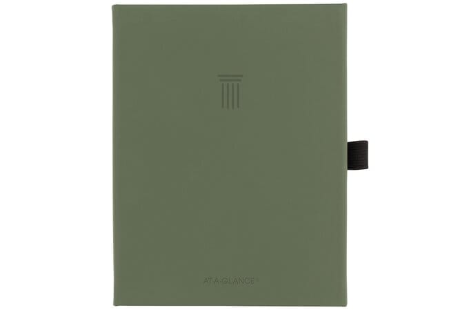
The Foundation Planner from At-A-Glance
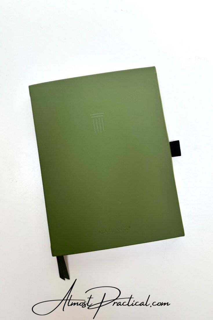
The Foundation Planner from At-A-Glance is unique in that it is geared towards goal setting. Starting with a mind map you can use this planner to set your goals and break them down into a plan of action.
Of the three planners that I received to share with you, this is the one that I am most excited about!
The Foundation Planner is an undated planner with lots of space for goal setting, tracking, and achieving. It outlines a three step approach that you can use to reach your goals.
The process is simple:
- Step 1: Envision your objectives
- Step 2: Break your goals into smaller actionable tasks
- Step 3 Create good habits to stay on track
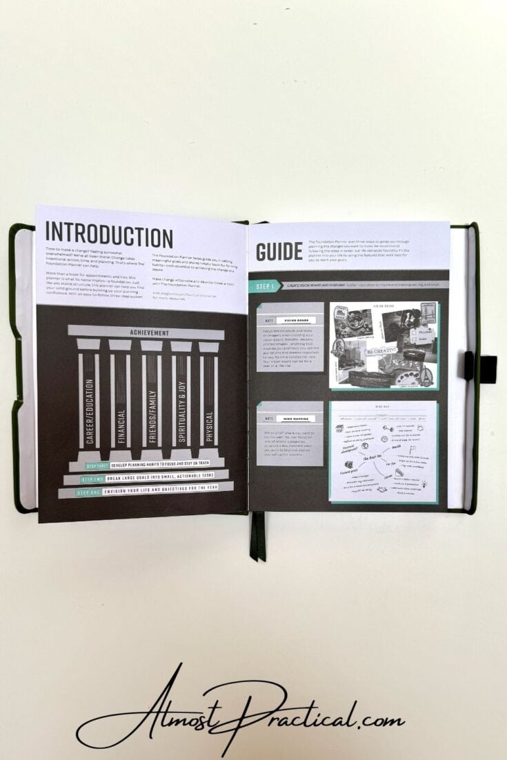
Because The Foundation Planner is such a powerful tool, the book begins with a guide to show you how to use it.
This guide outlines the steps and gives you examples of how to use the space.
Envision Your Objectives
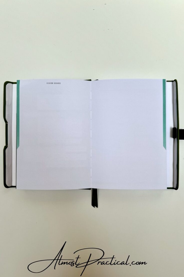
The first section of The Foundation Planner from At A Glance provides you with space to create a vision board.
You can use this space to paste in anything that inspires you. Add quotes and photos and clippings of the results that you can expect to achieve when you accomplish your goals.
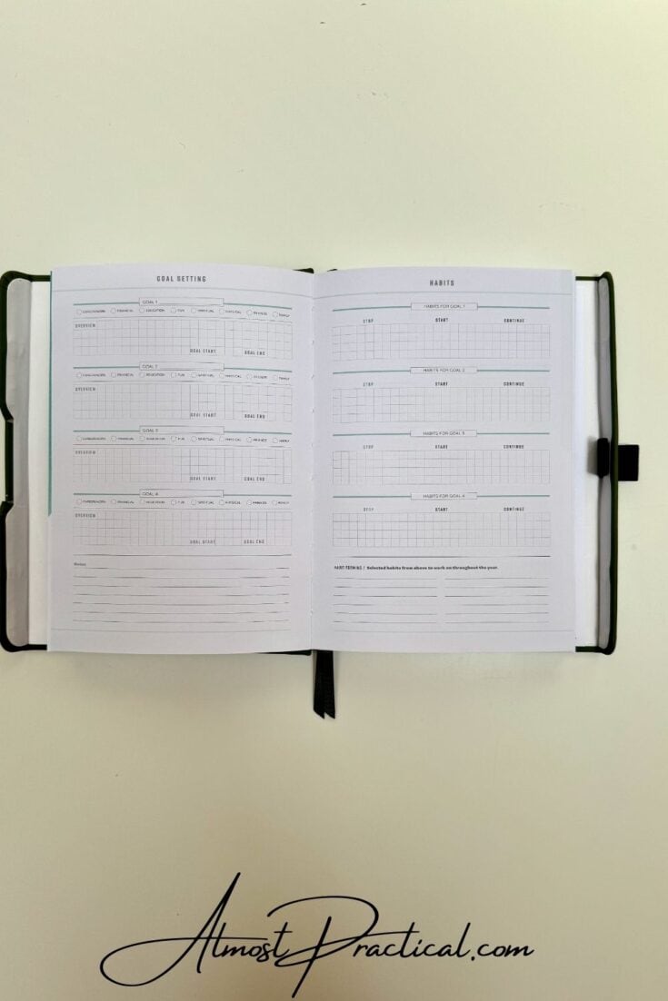
This is followed by space to outline your goals for the year and the habits that you want to put into place to facilitate the process.
Break Your Goals Into Actionable Tasks
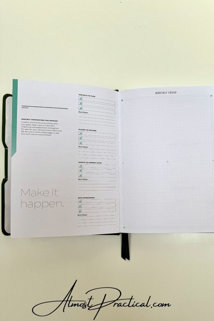
Once you have outlined your goals for the year, you use the following sections to break them down into monthly projects as well as other objectives you want to accomplish each month.
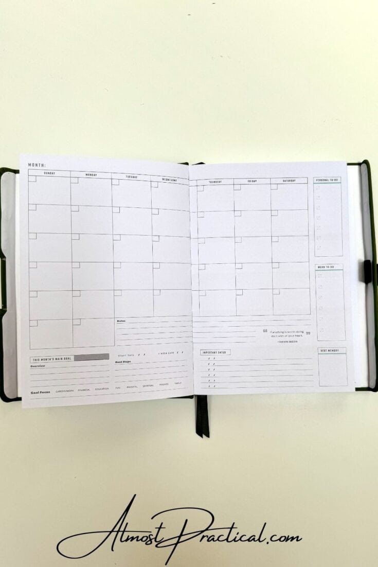
You then have a two page per month undated spread followed by two page per week spreads.
Create Good Habits
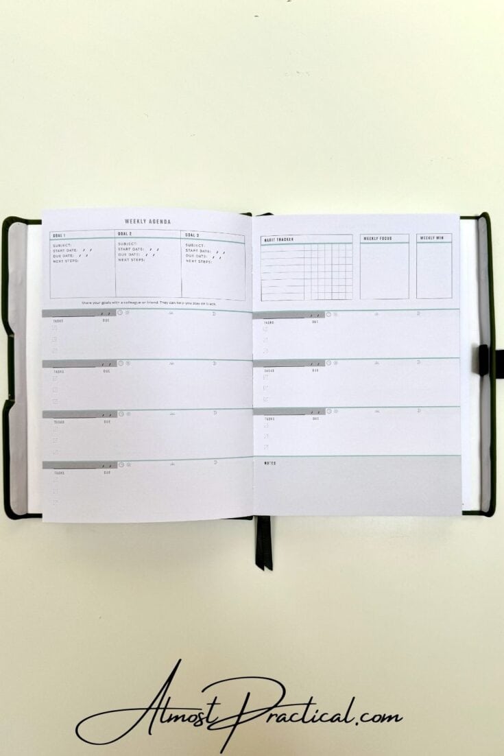
Sprinkled throughout this planner are habit trackers that will keep you accountable to maintaining progress on your goals.
Pros and Cons of The Foundation Planner
There is so much to like about The Foundation Planner!
It’s strong emphasis on goal setting and accountability makes it unique compared to other planners that are designed to simply help you map out your day.
I love that it is undated because you can “jump” in and out of the planner if you want to take a month off here and there for vacation or summer or other life events. This makes it last longer with less wastage if you decide to take a break.
The undated design also makes it easy to start the planner anytime you want, so you don’t have to wait until January or July to get started.
However, I do wish that this planner was a bit larger in paper size – like an 8×11. There is so much to outline and brainstorm in here that I think a little more space to write would be beneficial.
So Many Great Planning Options
The At-A-Glance line of planners has evolved so much over the years and I love the new offerings! The three listed here are just a touch of what they have on their website so I encourage you to check it out here.
There are also a variety of formats and designs such as the ones that I reviewed here – coiled, ring agenda, or a bound book. I am a big fan of the Emily Ley line for At-A-Glance but I also like the home offerings like The Foundation Planner.
With all these choices there is no room for excuses not to get organized.
Happy planning!

