Erin Condren Colorful vs Neutral Theme – Which One Should You Choose?
This post may contain affiliate links which means I make a commission if you shop through my links.
Disclosure Policy
If you are just getting started with the Erin Condren LifePlanner – or any of her planners for that matter – you are in for a treat.
I have been using the Deluxe Monthly Planner to plan out this blog and it really is keeping me on track.
One of the best parts about every Erin Condren planner is that you have so much flexibility in customizing it to make it your own.
You can choose the:
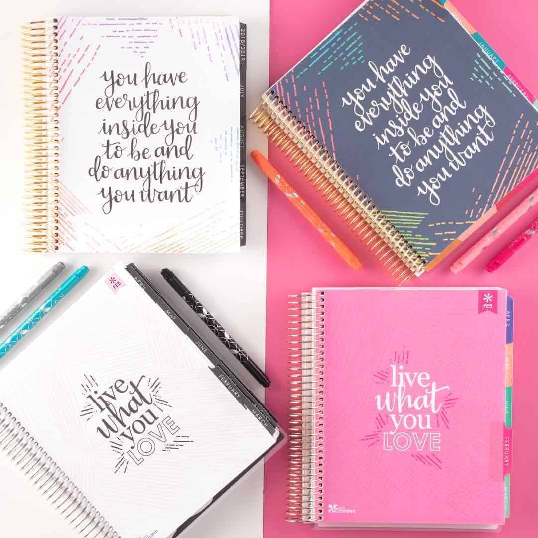
- cover (and even put your name or initials on it),
- layout, and
- the color theme inside.
Choices, choices!
So, let’s talk about that color theme.
Erin Condren Colorful vs Neutral Theme
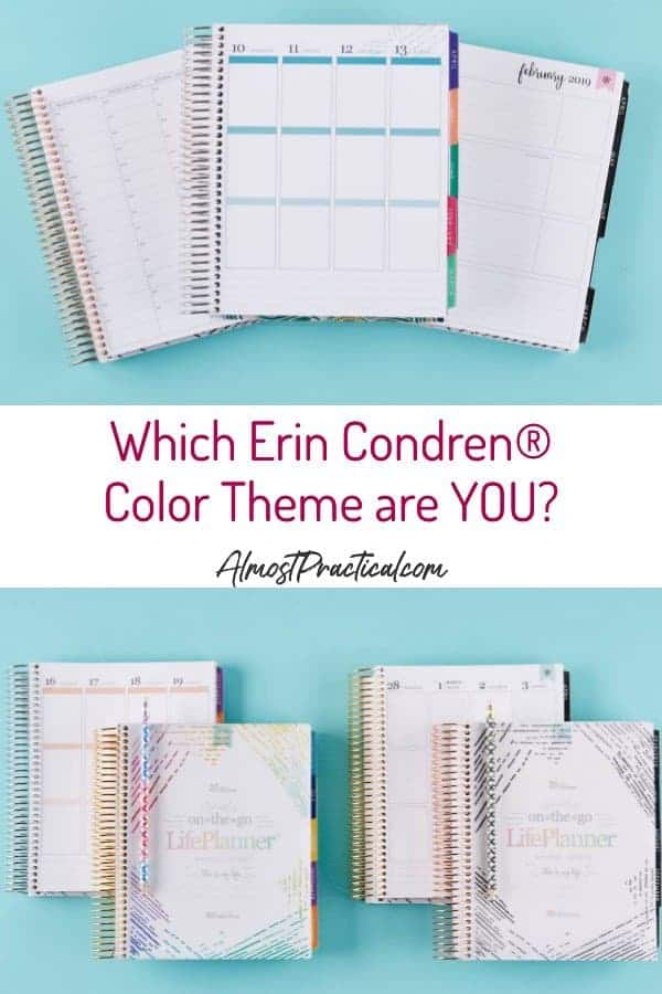
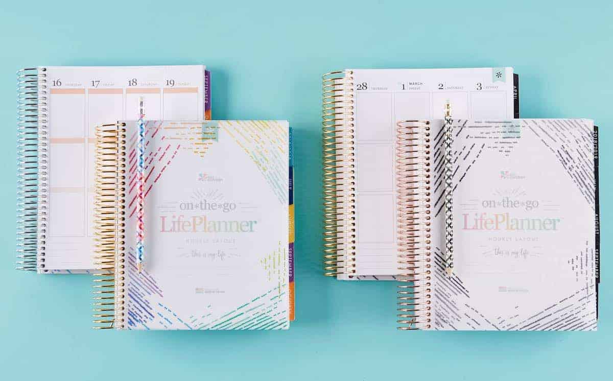
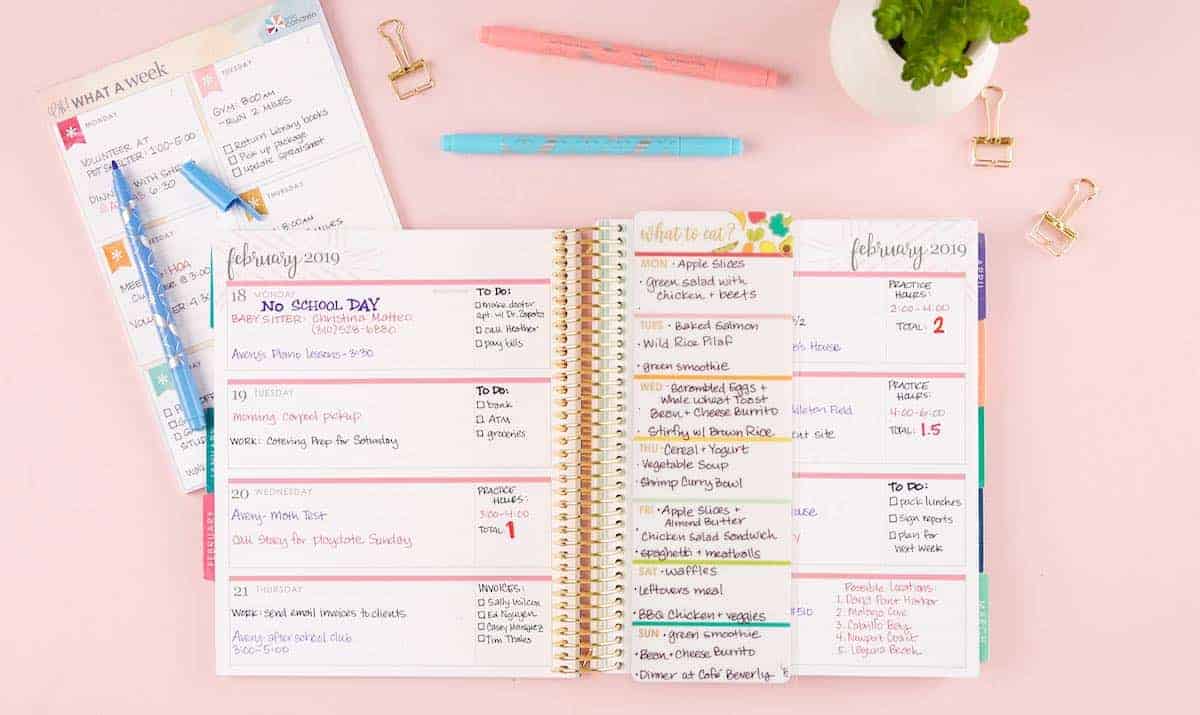
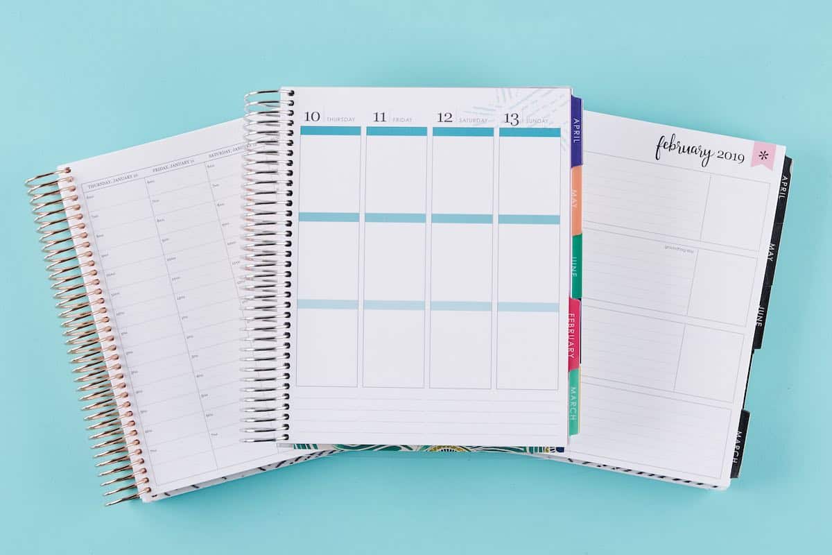
Erin Condren offers two choices – a colorful theme and a neutral theme.
Both are beautiful and making a choice between the two is pretty tough.
I have had planners in both themes – so I can give you my thoughts and hopefully it will make your decision a little easier.
First – let me say that I am colorful person (in more ways than one! 🙂 ) I really love pops of color everywhere.
So, I was drawn to the Erin Condren colorful theme right away.
When I ordered my first LifePlanner there was no doubt in my mind that I would get the colorful theme – which is what I did.
Truly, I loved it.
However, when I ordered my Deluxe Monthly Planner I thought maybe I would try something different.
So, I went with the neutral theme – which I like as well.
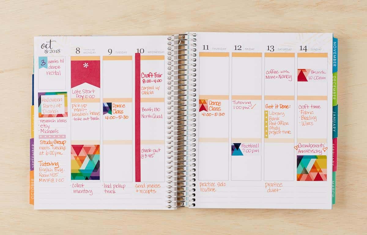
Advantages of the Erin Condren Colorful Theme
Let’s put it this way – if color makes you happy, the colorful theme will make you happy.
Every year the exact colors change up a bit – but I have them to always be uplifting and happy colors.
However, if you tend to write in your Erin Condren planner with colored pens and if you use lots of stickers, stickies, and embellishments then the colorful theme to get a little busy.
Which brings me to the …
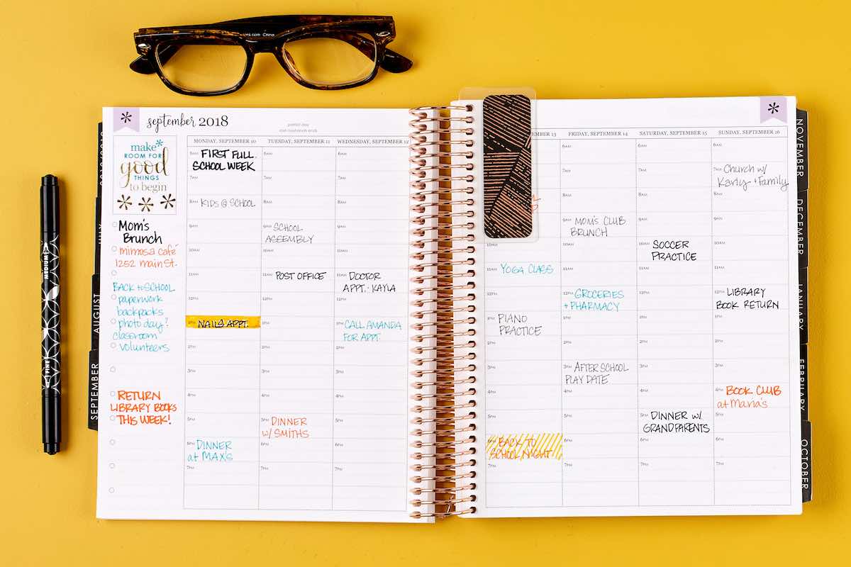
Advantages of the Erin Condren Neutral Theme
Because I do like pops of color to remind me of things, I felt like the neutral theme would allow my writing to jump out more.
So, for my second Erin Condren planner I went with the neutral theme.
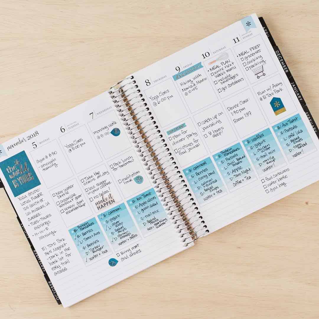
The neutral theme is based on shades of blacks and whites. There are a few details in color here and there, but the colors are muted and more pastel-ish.
While I like do the neutral theme – because, yes, it does help my own writing to pop – the one thing that I wish I could change is the color of the tabs.
In the colorful theme the tabs are happy colors, but in the neutral theme the tabs are a dark black with white writing and are very severe. I would have preferred maybe a softer grayish background.
Which Erin Condren Theme Should You Choose?
As you can see, it is all a matter of personal preference.
The colorful theme is fun and happy and personally, I think I like it best.
However, I do feel that the neutral theme is a little more professional looking. If you make a living in a boardroom surrounded by suits then the neutral theme combined with a more conservative cover might be the way to go.
What did you decide?
Tell us which Erin Condren planner color theme you like best.
All photos are ©ErinCondren and are published here with permission.
Pin this article to your favorite board on Pinterest to refer to later.
