Which Planner Layout Will Make You More Productive?
This post may contain affiliate links which means I make a commission if you shop through my links.
Disclosure Policy
With the New Year looming ahead, you might be ahead of the game and already have your new planner.
But if you haven’t yet picked up a calendar to plan your time – you might be wondering which planner layout is best for you.
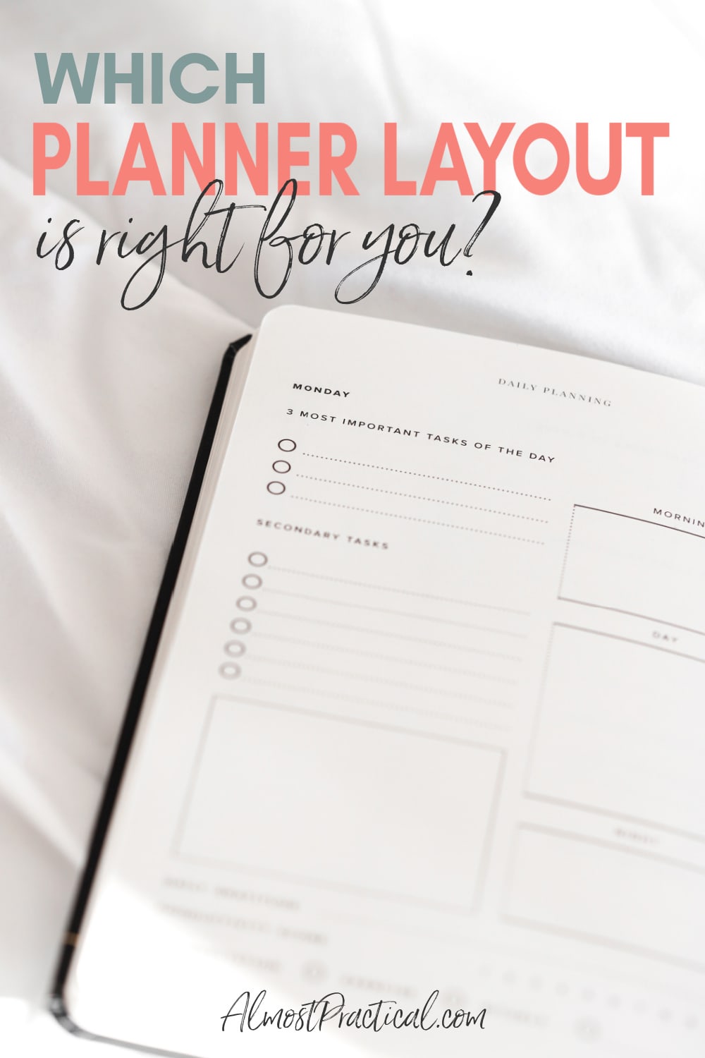
It comes down to personal preference, of course, but each format has its advantages.
Personally, I now use a two page per week hourly layout.
However, I have tried them all and here are some things to consider as you head out the door to buy your paper companion for the next 365 days.
The Most Common Planner Layouts
Planners generally come in a few standard layouts.
- One or two pages per month
- Two pages per week
- One page per day
- Two pages per day
One Or Two Pages Per Month
The one page per month is one of the most simple calendar layouts.
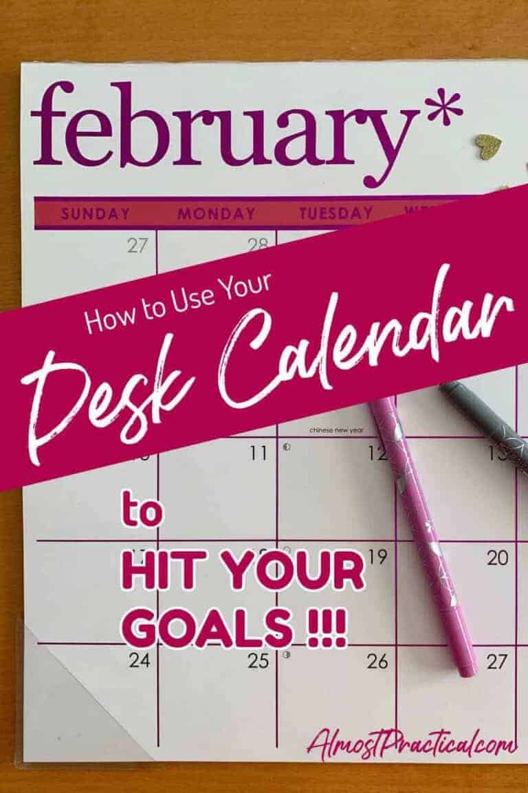
This is free calendar material – the kind that banks, stores, and charities will send you for free at the end of the year.
They are also in abundant supply as printables online. And actually, they do make sense to print out because they only take 12 sheets of paper – one for each month.
You can hang them on your wall or keep them in a desk drawer and they are great for getting important information in one quick glance.
The downside is that space is limited because you can only write so much in the one little box that you are given for each day.
I like to use these as “working” calendar pages.
Perhaps for my editorial calendar or to plan out a project and brainstorm ideas and timelines.
Once my planning is final, I will transfer the info into my real planner and toss my one page per month calendar pages.
So, hang onto those free calendars and use them as a planning board throughout the year.
If you like the monthly layout but want space for notes, and something more polished than a free calender – you should check out the Erin Condren Monthly Planner.
This planner has a 2 page per month layout and each month is followed by blank note pages. This is great for project planning.
Two Pages Per Week
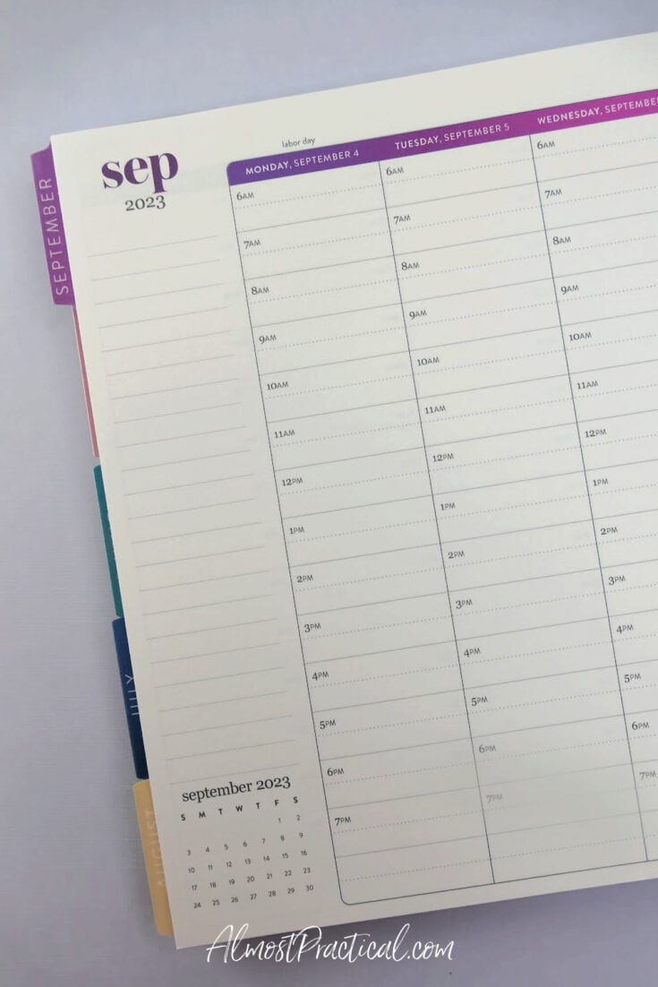
A two page per week calendar layout is just what it sounds like – seven days of the week are laid out across a two-page spread.
Usually, this style of planner also has a one or two page per month spread at the beginning of each month as well.
I have seen these in both a vertical format (what I think of as Erin Condren’s signature layout) and in a horizontal layout.
Right now, my planner layout of choice is a 2 page per week spread.
I like the 2 page per week concept because I can see the whole week at once.
This way, I know right away if one day is busier than another and can then adjust what I have to do accordingly.
If Wednesday is jam packed I can then run my errands on Thursday instead.
The two page per month spread at the beginning of each month can be a bit redundant, so I don’t use this section to duplicate information and appointments.
Instead, I use it to keep track of when I publish an article on my blog and send out newsletters. I actually give myself a little star sticker every time a post goes up.
I am also toying with the idea of using this space as an editorial calendar as well – but I think I’ll probably go a little more techy with that.
One Page Per Day
A one page per day planner layout gives you one full page for each day. You also get the two page per month at the beginning of each month too.
An example of this type of planner is the Erin Condren Daily Duo.
In this particular planner, each page is divided into two halves. You map out your schedule on an hourly grid on one side and list out your To Do items for the day in a lined section on the other side.
There is even space to jot down notes as well.
The advantage, of course, is that you have plenty of room for planning.
But the downside is that you cannot see the whole week at once. You will have to turn pages to find the notes that you are looking for versus looking at a two page spread and picking out the exact detail.
I am also big on using colorful sticky notes and stickers to grab my attention, and these work perfectly on the two page per week planner layout.
Two Pages Per Day
Two page per day planners are great for people who take a lot of notes. One page is usually dedicated to your hourly schedule and to do list. the second page is usually a blank lined sheet that you can use to journal or record important points that come up during the day.
A few years ago, I thought that the two pages per day planner layout was perfect for me.
In fact, I stuck with it for two years (also because I love the Blooms planners by Franklin Covey, which have just been redesigned) and that was much longer than I should have.
The bottom line was that I just didn’t have enough to write about every single day to fill up 2 pages. So, many of my days were just blank. When I needed something that I wrote down, I would really have to dig and flip through tons of pages to find the exact note.
But what works for me, might not work for you and vice versa.
Which Planner Layout Is Right For You?
With so many choices it is hard to figure out which planner is perfect for you.
Consider whether you will be:
- using your planner to supplement your online calendar
- writing a lot of notes each day
- carrying your planner around a lot
- grabbing your info in a quick glance.
For me, the two page per week vertical planner layout by Erin Condren is perfect (you can take a closer look at the LifePlanner here).
Which planner layout will you be choosing in the upcoming year?
Tell us in the comments below.


Hey Neena,
How is it going?
My best friend — despite the fact that she works completely online — is a big fan of these planners.
God, these planners are so not my thing. I just can’t seem to carry anything physical with me. There’d be a day when I’d find carrying my laptop would be a pain too.
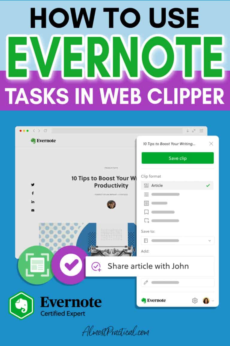
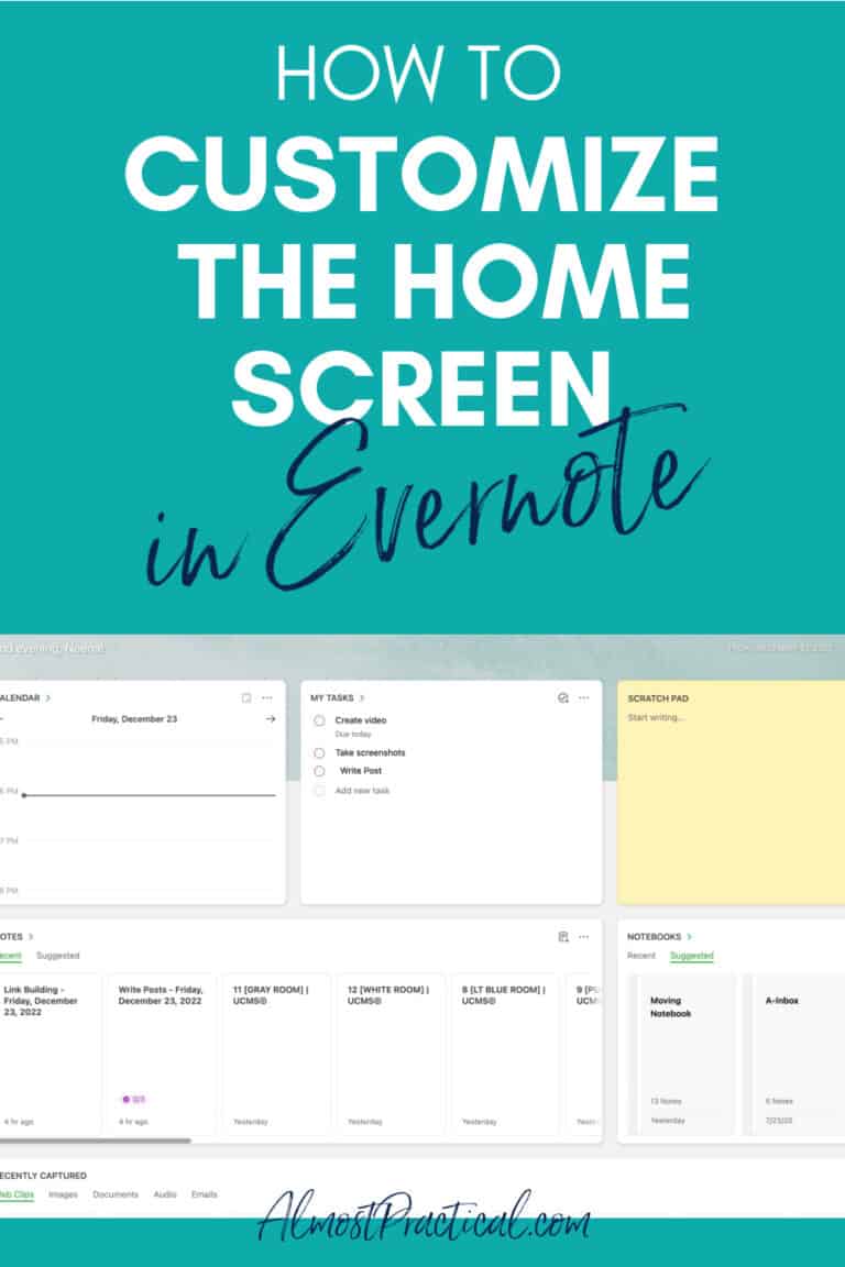
For now, I am sticking to Online calendars and reminders, including Evernote 🙂
Ash